KALM KAVA
CANNED DRINK DESIGN
CLIENT: College
PROJECT TYPE: Graphic Typography
THE CHALLENGE:
Our assignment was to design the packaging of a canned drink, using typography in a graphic way.
THE SOLUTION:
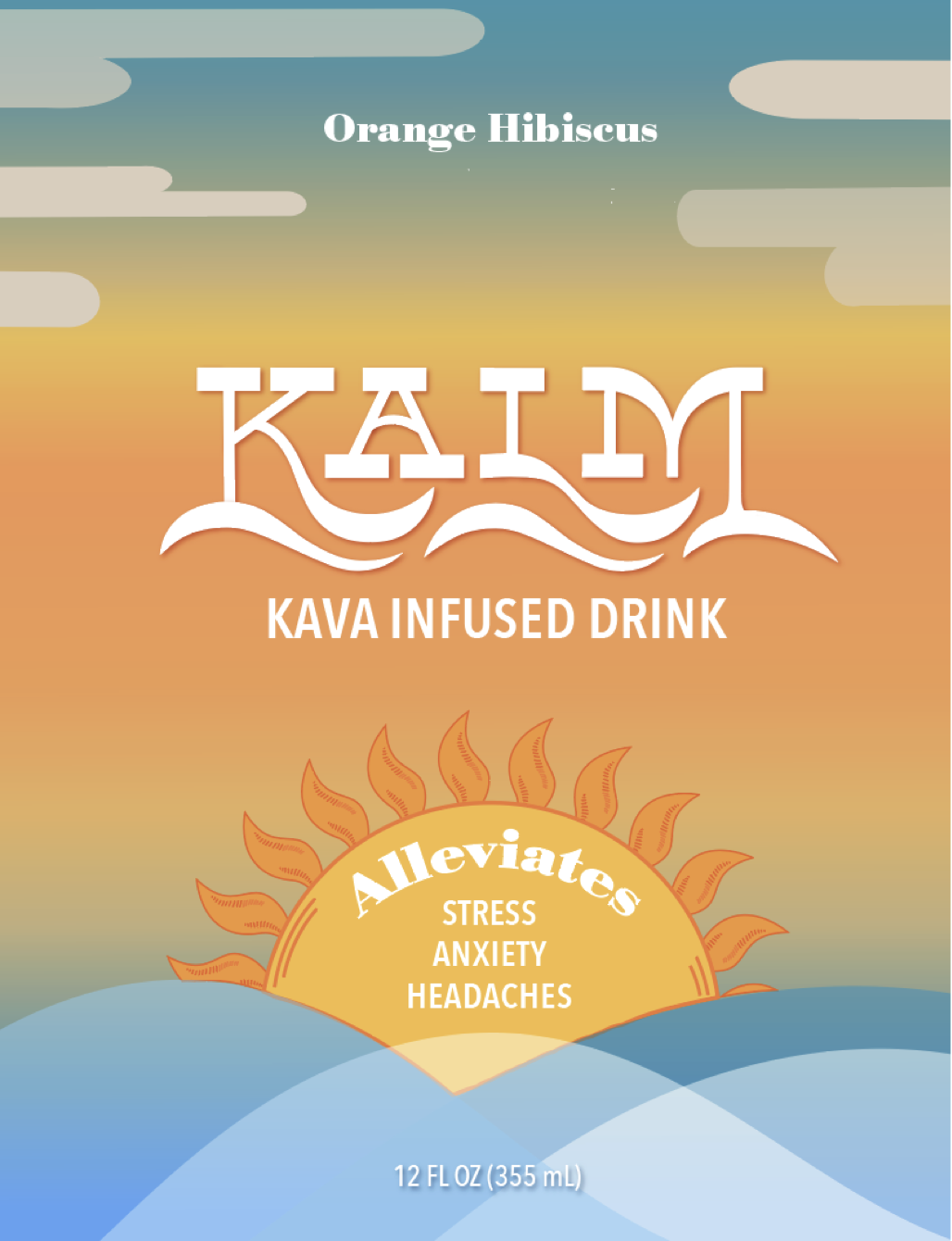
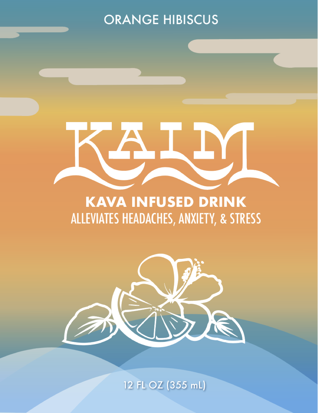
I came up with a kava infused drink that has a calming effect. For the main logo, I chose a typeface (Lone Pine) that had descenders that resembled a wave shape. This lead me to the idea of a sunset theme. To achieve this design I customized the type to make it more wave-like, and created a calm sunset background.
DESIGN PROCESS:
Because this assignment allowed us so much creative freedom, I had a little trouble getting started as there were endless ideas to choose from. Although I typically start in my sketchbook, I decided to start looking for inspiration on Adobe Fonts. I came across “Lone Pine,” which is described to be “reverse-contrast, serif typeface with 110% zazz and juuj.” I was intrigued by the long, flowy descenders which reminded me of waves. Once waves came to mind, I started piecing other ideas together, eventually settling on a sunset theme for the “Kalm Kava” concept.
On Illustrator, I took the descenders from the typeface and used them to personalize the font to my liking, creating a wave-like design. I believe using parts of the font, instead of using the pen/pencil tool helped me maintain a more consistent, seamless look.
My biggest challenge was finding a creative and appealing way to include the drink’s benefits. I liked the idea of including the copy in a sun, so I made multiple iterations and tested out different type pairings until I was satisfied.


