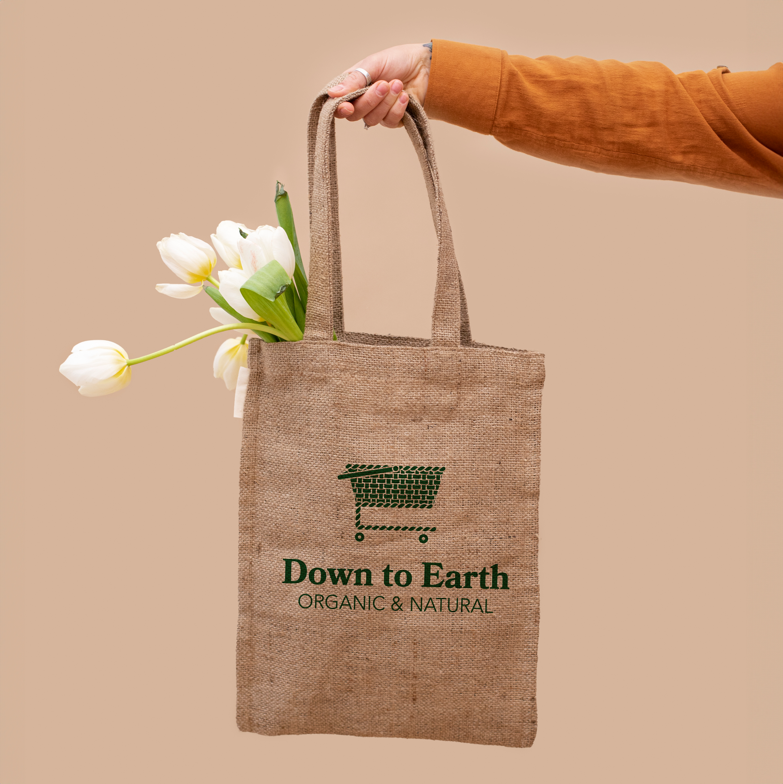
DOWN TO EARTH
ORGANIC AND NATURAL
CLIENT: College
PROJECT TYPE: Brand Identity
THE CHALLENGE:
Our assignment was to create a logo for a fictional brand, or to redesign a logo for an existing company. I decided on Down to Earth; it is one of my favorite food retailers, so I was confident that my familiarity with the business would help me be able to capture the businesses’ clean and inviting atmosphere.
THE SOLUTION:
I considered what set the store apart from others, which helped me decide on the key elements I wanted to include in the icon. I eventually came up with the idea of combining a shopping cart and fruit basket.
BRAINSTORMING
IDEATING
SKETCHING
After doing some research about the company, I started sketching symbols that came to mind. Initially, the sun, ocean waves, and plants were symbols that popped-up, but it seemed too predictable. I started picturing the beautiful produce in the store and came up with the idea of a fruit basket. I wanted something that felt a little more clean and modern at the same time. Then, I wondered if it was possible to combine the basket with a shopping cart—an icon commonly used for shopping.
I fell in love with the concept and tried out a few aesthetic styles and font pairings.
EXPERIMENTATION


