MIYAJI DESIGN
(my personal logo for freelance design)
THE CHALLENGE:
I wanted a meaningful logo for myself that I could use as a profile picture and potentially include in my work.
THE SOLUTION:
The icon I came up with is a combination of the letter “Y” as well as the Japanese hiragana character “り” (ri). My first name, Emiri, is a Japanese name pronounced similarly to the common American name Emily. When translated to English, it’s spelled with an “R” because there is no distinction between “L” and “R” in the Japanese language. Growing up, my family in the states called me Emily to match the Japanese pronunciation, but when I began school I went by Emiri (pronounced em-o-ree) as I was tired of constantly explaining why my name sounds differently than how it’s spelled. The name Emiri grew on me, but I always felt a slight disconnect as it sounds so different from my Japanese name. At the same time, respelling my name to “Emily” for others to pronounce it correctly felt wrong—like I was throwing away its Japanese background. I eventually dropped the last two letters and began going by “Emi” as a nickname to avoid the trouble.
Combining “り” and “Y” represents the combination of two names I had growing up, as well as the freedom of not having to choose between the two, as I genuinely like both.
In regards to the aesthetic choices, I wanted the logo to look like a combination of shodo/shuji (Japanese calligraphy) and cursive, to represent my bicultural identity. I aimed for a design that was sophisticated, clean, and simple.
DESIGN PROCESS:
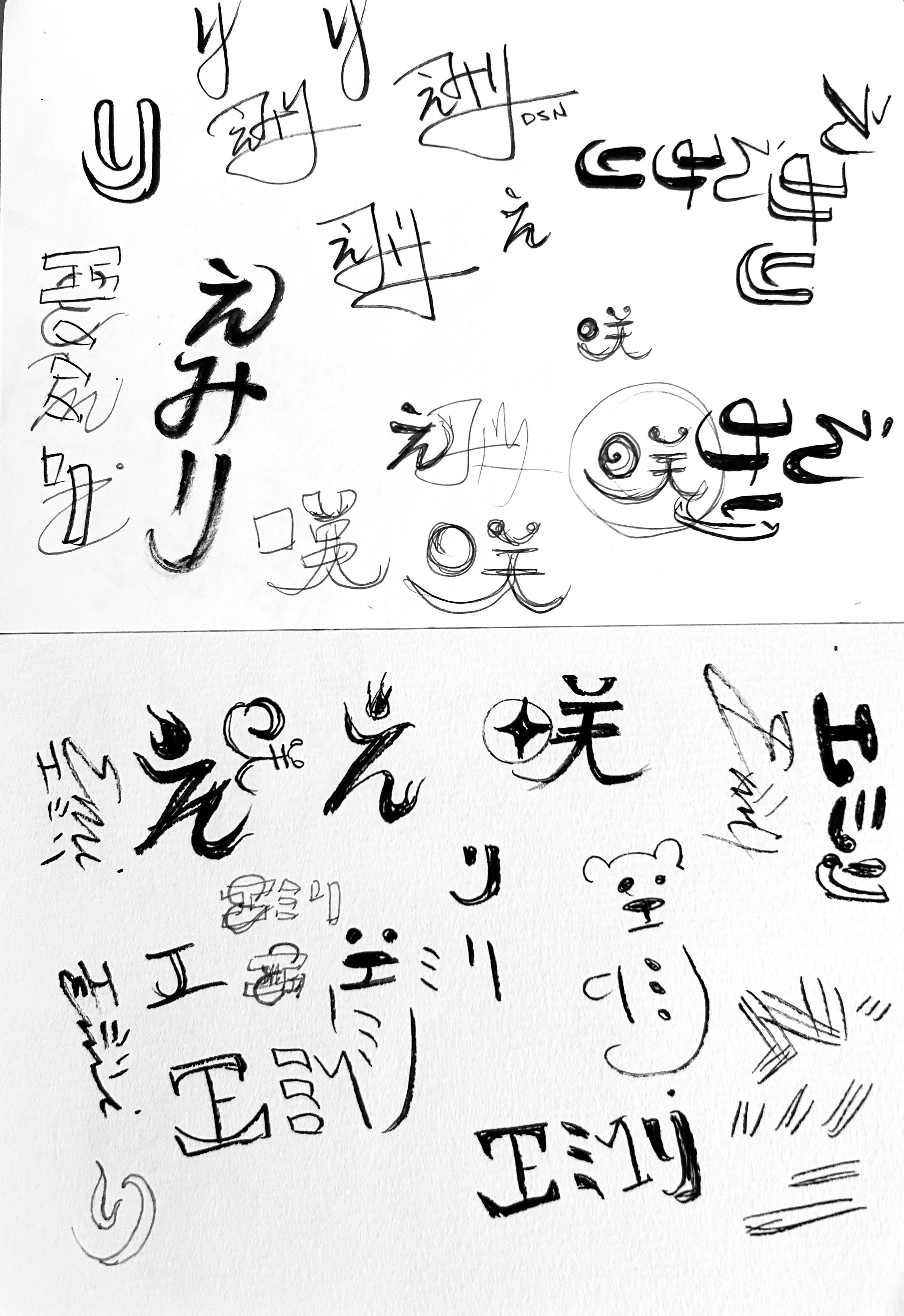
I knew I wanted a design that involved my name and my bicultural identity. I played around with making stylized versions of my Japanese kanji character “咲,” as well as combining English and Japanese characters in other ways. The idea of combining the “Y” and “り” arose after I set my sketchbook down and I was laying in bed. I immediately got up and started further elaborating on this idea; I know I have a winner when I get this excited about an idea.
I started vectorizing the logo mark and experimenting with typefaces. I eventually decided on my all-time favorite font: Clarendon.
NORMAL:
INVERTED:


